The Data
One of my favorite DC blogs is POPville - written by the Prince of Petworth himself, Dan Silverman. While skimming through posts earlier this week, I noticed an entry containing data on August, 2017 DC home and condo sales compiled by Kevin Wood, a local Realtor. True to form, I couldn’t wait to dig into it and see what I could learn about the city’s real estate market!
Preparing the Data
I downloaded the Excel version of the data set from the POPville post and imported the data into RStudio for my analysis. To get things going, I created a dataframe with the sales data, and also created a new column to calculate the difference between closing prices and list prices.
library("tidyverse")
library(readxl)
library(scales)

fill <- "dodgerblue4"
line <- "grey22"

sales <- read_excel("YOUR_PATH/August2017Sales.xls", col_types = c("text", "text", "numeric", "numeric", "numeric", "numeric", "numeric", "numeric", "date"))
sales <- mutate(sales, sale_diff = close_price - list_price)
View(sales)
Then, I grouped the information in ZIP code buckets, averaging the core data points across all the sales in each ZIP. With this done, I could start to dig into the numbers for each ZIP code in the city!
g_zip <- sales %>% group_by(zip) %>% summarise(count = n(), avg_list_price = mean(list_price), avg_close_price = mean(close_price), avg_subsidy = mean(subsidy[subsidy>0]), avg_bd = mean(bd), avg_bath = mean(bath), avg_half_bath = mean(half_bath), max_close_price = max(close_price), min_close_price = min(close_price), avg_sale_diff = mean(sale_diff))
Findings
Sales Data by ZIP Code
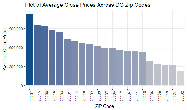
plot_zip_prices <- ggplot(data = na.omit(g_zip), aes(x = reorder(zip, -avg_close_price), y = avg_close_price, fill = avg_close_price)) + geom_col() + scale_y_continuous(name = "Average Close Price", labels = comma) + ggtitle("Plot of Average Close Prices Across DC Zip Codes") + labs(x = "ZIP Code") + scale_fill_gradient(low = "light grey", high = fill) + theme_bw() + theme(legend.position="none", axis.text.x = element_text(angle = 90, hjust = 1))
plot_zip_prices
This data set is interesting to me because it begins to highlight which housing markets within DC are “heating up”. Seeing a positive difference between closing price and list price implies increased competition for homes in these ZIPs, and is where rapid-fire bidding wars are most likely to take place.
We’ll check this data out in greater depth in a few minutes, but it’s interesting to see Brookland, Congress Heights/Anacostia, and Logan Circle as the three “hottest” ZIPs with Georgetown, Kalorama/Woodley Park/Cleveland, and West End as the three “coldest” ZIPs.
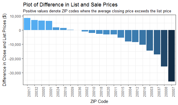
plot_zip_sales_diff <- ggplot(data = na.omit(g_zip), aes(x = reorder(zip, -avg_sale_diff), y = avg_sale_diff, fill = avg_sale_diff)) + geom_col() + scale_y_continuous(name = "Difference in Close and List Prices ($)", labels = comma) + ggtitle("Plot of Difference in List and Sale Prices") + labs(x = "ZIP Code", subtitle = "Positive values denote ZIP codes where the average closing price exceeds the list price") + scale_fill_gradient() + theme_bw() + theme(legend.position="none", axis.text.x = element_text(angle = 90, hjust = 1))
plot_zip_sales_diff
When are Sales Happening?
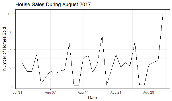
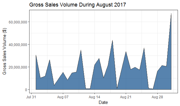
One cool trend from both of these charts is the spike in sales occuring each Monday (the three highest mid-month points) - clearly folks are investigating homes on the weekend and looking to get their weeks off to a good start.
g_date <- sales %>% group_by(close_date) %>% summarize(count = n(), gross = sum(close_price))

plot_num_sales <- ggplot(na.omit(g_date), aes(x = close_date, y = count)) + geom_line() + scale_y_continuous(name = "Number of Homes Sold", labels = comma) + ggtitle("House Sales During August 2017") + labs(x = "Date") + theme_bw()
plot_num_sales

plot_gross_sales <- ggplot(na.omit(g_date), aes(x = close_date, y = gross)) + geom_area(alpha = 0.7, color = line, fill = fill) + scale_y_continuous(name = "Gross Sales Volume ($)", labels = comma) + ggtitle("Gross Sales Volume During August 2017") + labs(x = "Date") + theme_bw()
plot_gross_sales
Mapping ZIP Code Sales Data
When I started this exercise, the thing I wanted to do most was visualize different types of sales data on top of a map of DC broken up by ZIP code. After wasting an embarrassing amount of time with fruitless Googling and Stack Overflow-ing, I finally found what I needed - the choropleth map. A crazy name for a relatively intuitive map, the choropleth breaks down the frequency or proportion of a measurement over blocks of space in a map.
Armed with my new favorite word, I set out in search of how to make my own choropleths in R. Eventually I stumbled on the choroplethrZip library from arilamstein and was able to get his code going on my machine.
install.packages("devtools")
library(devtools)
install_github('arilamstein/choroplethrZip@v1.3.0')
library(choroplethrZip)
With the choropleth library set up, all I needed to do was pass a dataframe with two columns, named region and value, into the zip_choropleth function to start making maps.
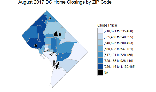
No surprises here - sales in Northwest dominate this chart, with many of the most expensive occurring in Georgetown or Kalorama.
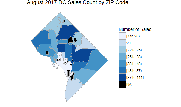
This map shows where the most transactions are taking place across the city: H Street/NOMA/Eckington takes the lead with 111 purchases in August, followed by the 14th Street Corridor/Adams Morgan with 94, and then Petworth/Brightwood/16th Street Heights with 87.
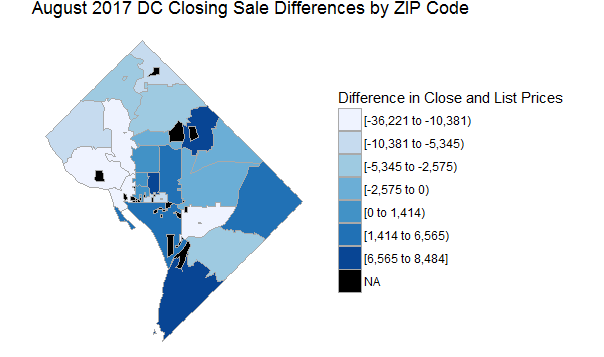
As alluded to earlier, this map shows the difference in list vs. closing price across DC ZIPs - another good way to see which neighborhoods are receiving above-market interest. While they may dominate the price charts, ZIPs throughout Northwest fare poorly by this metric, frequently selling for much less than asking. Interest in properties along the periphery of DC proper could also mean that speculation is moving further from the urban core, as more buyers are priced out of expensive neighborhoods and bidding up prices for less-expensive areas.
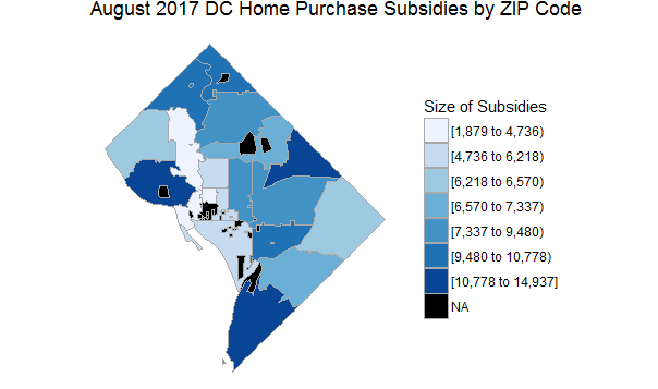
Interestingly, the ZIP code (20032) receiving the highest average purchase subsidy, at just under $15,000 per transaction, was #2 in the previous section, where closing prices exceeded list prices by almost $7,000. I’m not totally sure the significance of that connection, but an easy inference to make is that government subsidies are bolstering the finances of home buyers in Southeast DC, artificially raising sale prices. I’ll be curious to see if this is a one-time coincidence, or turns out to be a trend moving forward.
zip_price <- select(g_zip, region = zip, value = avg_close_price)
choro_price <- zip_choropleth(zip_price, state_zoom = "district of columbia", title = "August 2017 DC Home Closings by ZIP Code", legend = "Close Price") + coord_map()
choro_price

zip_sales <- select(g_zip, region = zip, value = count)
choro_sales <- zip_choropleth(zip_sales, state_zoom = "district of columbia", title = "August 2017 DC Sales Count by ZIP Code", legend = "Number of Sales") + coord_map()
choro_sales

zip_subsidy <- select(g_zip, region = zip, value = avg_subsidy)
choro_subsidy <- zip_choropleth(zip_subsidy, state_zoom = "district of columbia", title = "August 2017 DC Home Purchase Subsidies by ZIP Code", legend = "Size of Subsidies") + coord_map()
choro_subsidy

zip_sale_diff <- select(g_zip, region = zip, value = avg_sale_diff)
choro_sale_diff <- zip_choropleth(zip_sale_diff, state_zoom = "district of columbia", title = "August 2017 DC Closing Sale Differences by ZIP Code", legend = "Difference in Close and List Prices") + coord_map()
choro_sale_diff
Sales of the Month (5 Most Expensive Closings)
| Rank | Address | ZIP Code | List Price | Close Price | Bedrooms | Bathrooms | Half Bathrooms | Closing Date |
|---|---|---|---|---|---|---|---|---|
| 1 | 3241 R ST NW | 20007 | 4500000 | 4000000 | 5 | 3 | 2 | 8/15/2017 |
| 2 | 1339 29TH ST NW | 20007 | 4299000 | 3975000 | 7 | 4 | 2 | 8/21/2017 |
| 3 | 2922 GLOVER DR NW | 20016 | 3695000 | 3500000 | 6 | 5 | 1 | 8/1/2017 |
| 4 | 2121 S ST NW | 20008 | 3400000 | 2900000 | 5 | 4 | 2 | 8/17/2017 |
| 5 | 4054 52ND TER NW | 20016 | 2695000 | 2700000 | 5 | 4 | 2 | 8/1/2017 |
head(arrange(sales,desc(close_price)), n = 5)
Steals of the Month (5 Least Expensive Closings)
| Rank | Address | ZIP Code | List Price | Bedrooms | Bathrooms | Half Bathrooms | Closing Date |
|---|---|---|---|---|---|---|---|
| 1 | 3872 9TH ST SE #102 | 20032 | 65000 | 1 | 1 | 0 | 8/30/2017 |
| 2 | 3872 9TH ST SE #302 | 20032 | 64900 | 1 | 1 | 0 | 8/28/2017 |
| 3 | 5 BRANDYWINE ST SE #B-33 | 20032 | 40000 | 2 | 1 | 0 | 8/2/2017 |
| 4 | 5 BRANDYWINE ST SE #B-35 | 20032 | 40000 | 2 | 1 | 0 | 8/8/2017 |
| 5 | 3072 30TH ST SE #302 | 20020 | 26900 | 2 | 1 | 0 | 8/29/2017 |
tail(arrange(na.omit(sales),desc(close_price)), n = 5)
Wrap-Up
All in all, exploring this data set was a great way for me to keep building my R scales while also exploring some of the macro trends in the DC housing market.
Since POPville publishes the home sales dataset monthly, I hope to be back next month with an update!