While not the primary focus of this website, the US housing market is nevertheless a notable interest of mine and something that I will post updates on from time to time.
Last summer, I wrote a piece hypothesizing that the large share of current mortgages being held with now-unattainably low rates would interact with the still-expensive price of homes to limit liquidity in the housing market by 1) “trapping” current homeowners in their current mortgages (“golden handcuffs”), reducing supply and 2) suppressing demand from buyers who cannot afford to buy homes which remain expensive, but have much higher borrowing costs.
In the year that’s passed, I think it’s fair to say that both trends have continue to hold - the market remains both expensive and stagnant.
Given that my prior post focused more on the “golden handcuffs” side of things, I thought it might be interesting to take a bit deeper look at the buyer affordability side of the house here, to try to understand how the current market stacks up against historic trends.
Home Affordability Visualizations
What I’m curious about is modeling the combination of home prices, household income, and interest rates, as all three measures have changed materially over the past forty years. It’s the confluence of them that drives the end-of-day metric that hits consumers: their monthly payment, if they were to take out a 30-year fixed mortgage.
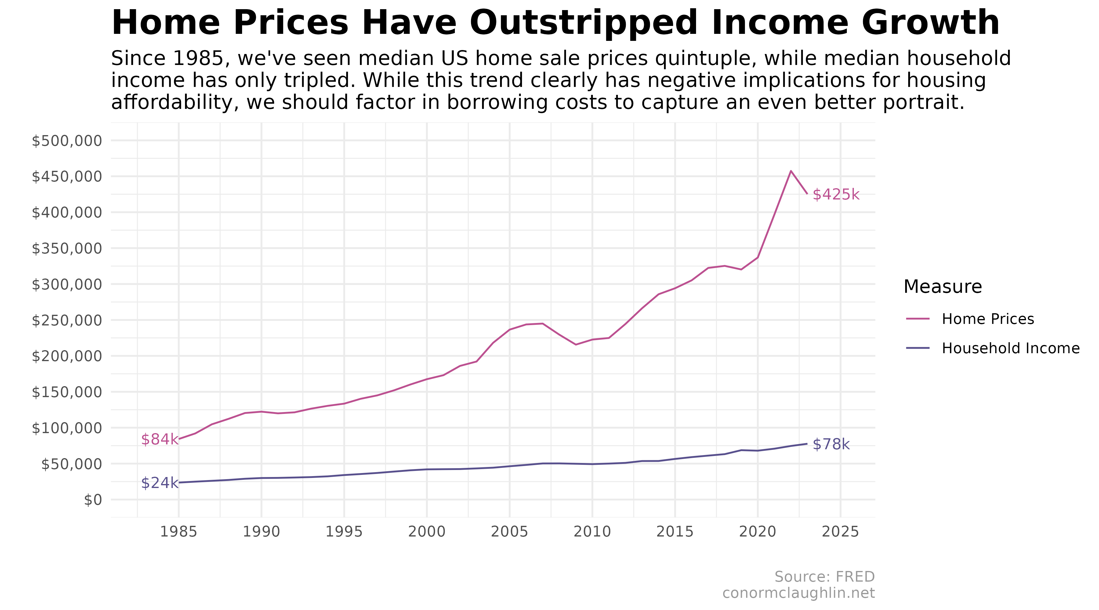
To start off with, we can observe that US household incomes have risen since 1985, but not quite as much as median home sale prices have.
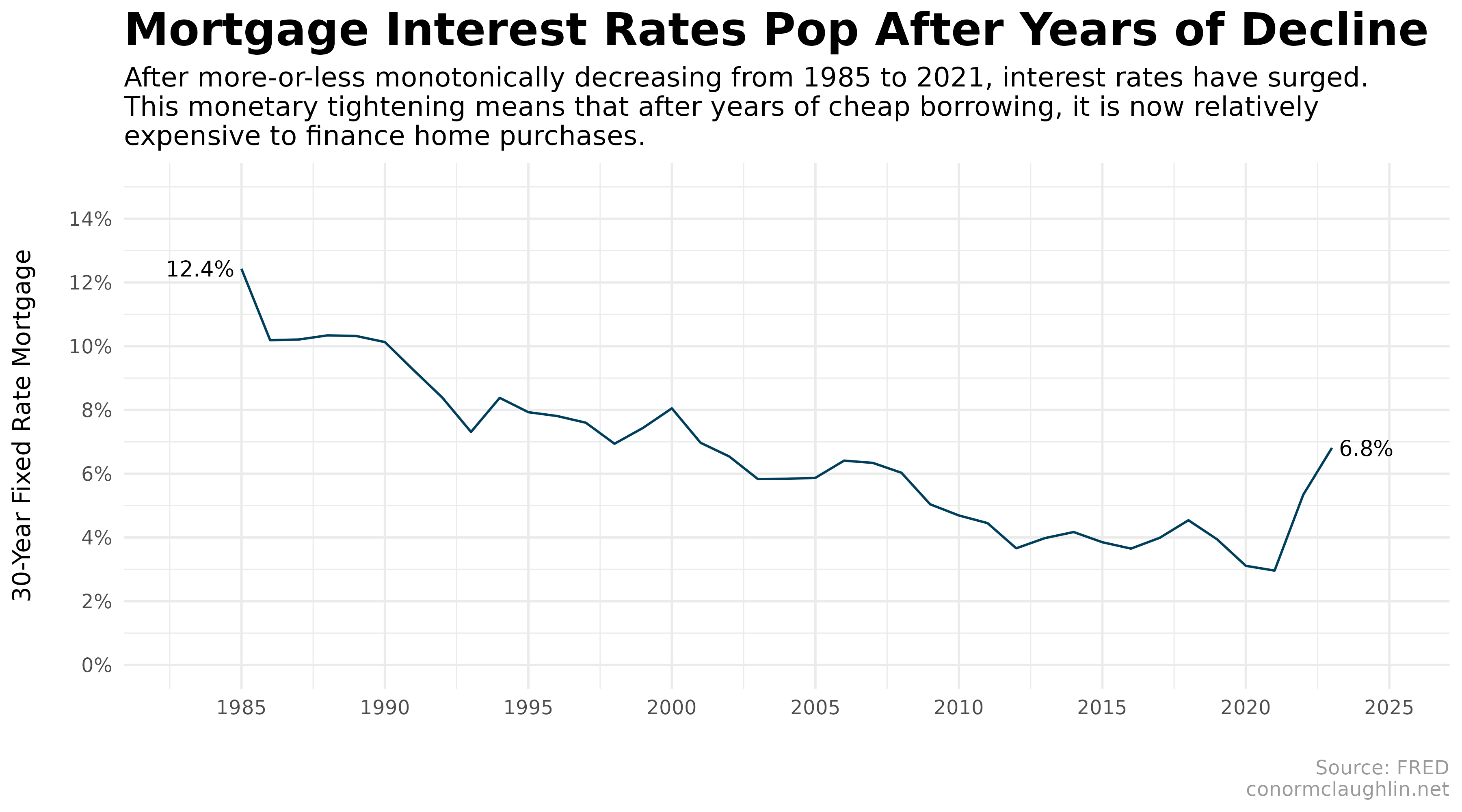
While homes have become much more expensive, relative to incomes, we’ve also seen the cost of borrowing decline notably (except for the last few years, of course).
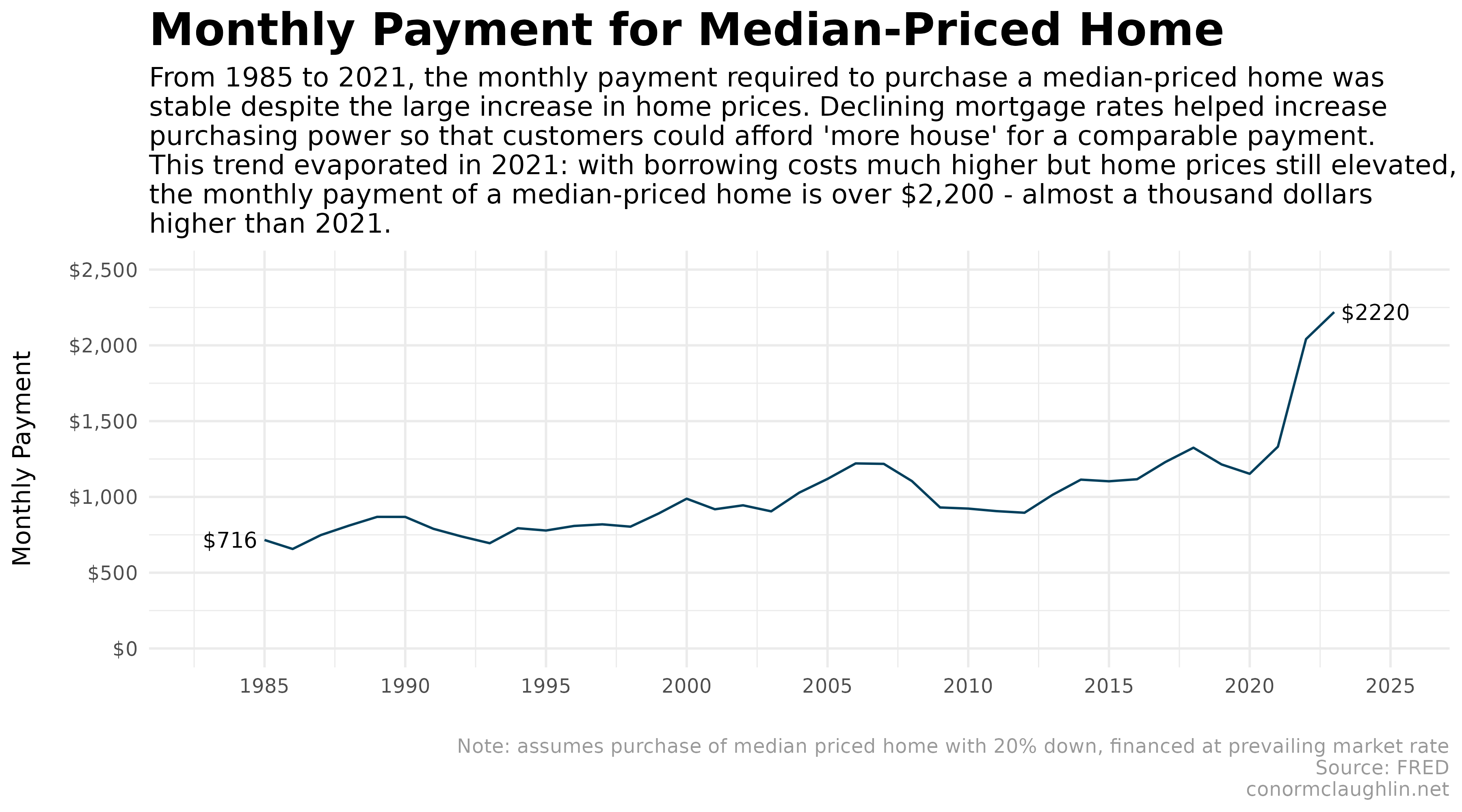
The long decline in mortgage rates has meant that the monthly payment that consumers would pay to purchase a median-priced house at the market rate of interest has increased only slightly over the last forty years - especially relative to the raw purchase prices, which have increased a ton as noted earlier.
This trend, of course, has reversed in the past three years, as inflation began to take hold and the Federal Reserve has responded with tighter monetary policy that has increased borrowing costs. Because we have yet to see a market-wide correction in home prices, and sale prices are still high, we find that high prices plus expensive mortgages has resulted a huge spike in monthly cost of ownership.
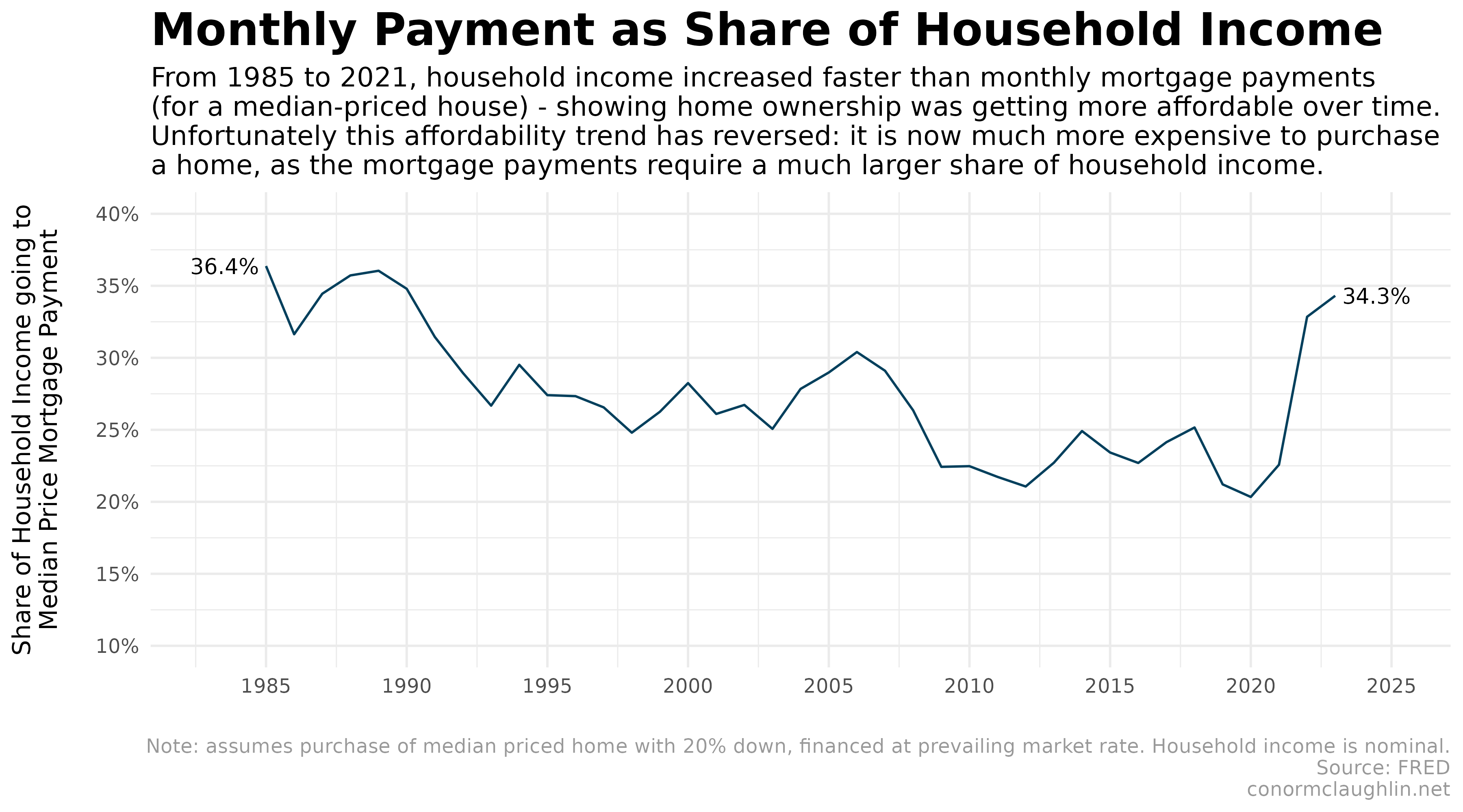
Our final chart takes the monthly mortgage payments computed above and contextualizes them as a share of median household income. This timeseries shows that from 1985 to 2021, homes became more affordable. This was because decreases in borrowing costs mostly offset the significant increase in home sale prices, leaving consumers with only a small rise in monthly mortgage payments. This, then, was offset by the higher incomes earned by households, resulting in a decreasing share of consumer’s wallets spent on home purchases.
However! Because it was so reliant on low interest rates, this affordability trend disappeared in 2022, leaving us where we currently stand with very high total cost of homeownership.
Ultimately, one of two things needs to happen to start to rationalize the housing market:
- The Federal Reserve cuts interest rates significantly, leading to lower mortgage rates for consumers. This would lower the total cost of home ownership by virtue of lower borrowing costs, and potentially decrease the typical share of monthly household income spent on a home purchase from 35ish% to something more like 25%
- Home sale prices decline in an absolute sense. While this is bad for those who view housing as an investment that must only go up, a downward correction in the market would lead to home prices that are better adjusted to what customers can actually afford to pay on a monthly basis given the current rate environment
Since I believe the Federal Reserve is going to hold rates higher than expected for longer than expected, out of an abundance of caution on inflation, I am hoping that we see #2 take place - otherwise, everyone may continue to be frustrated with the increasingly unaffordable market we see today.
Code Reference
Below, I wanted to share the code I used to build these visualizations, starting from the code which retrieves the timeseries data from the FRED portal, managed by the Federal Reserve Bank of St. Louis, and ending with the ggplot2 code for the charts themselves.
Set Up fredr
library(fredr)
library(tidyverse)

fredr_set_key("YOUR_KEY")
Fetch the Data Series We’re Interested In
Median US Home Purchase Prices
Median Sales Price of Houses Sold for the United States, from FRED.
house_df <- fredr(
  series_id = "MSPUS",
  observation_start = as.Date("1985-01-01"),
  observation_end = as.Date("2024-04-01"),
  frequency = "a"
)
Median US Household Income (Nominal)
Median Household Income in the United States, from FRED.
income_df <- fredr(
  series_id = "MEHOINUSA646N",
  observation_start = as.Date("1985-01-01"),
  observation_end = as.Date("2024-04-01"),
  frequency = "a"
)

# FRED has not published 2023 household figures yet
# impute based on personal income growth of 4.1% 2022 to 2023
income_df <- rbind(income_df, list(as.Date("2023-01-01"), "MEHOINUSA646N", 77637, as.Date("2024-04-05"), as.Date("2024-04-05")))
US 30-Year Fixed Mortgage Rates
30-Year Fixed Rate Mortgage Average in the United States, from FRED.
mort_df <- fredr(
  series_id = "MORTGAGE30US",
  observation_start = as.Date("1985-01-01"),
  observation_end = as.Date("2024-04-01"),
  frequency = "a"
)
Combine Dataframes and Pivot into Yearly Table
df <- rbind(rbind(house_df, income_df), mort_df) %>%
  select("date", "series_id", "value") %>%
  filter(date < "2024-01-01")

wide_df <- df %>% pivot_wider(names_from = "series_id", values_from = "value")
Define Function to Compute Monthly Mortgage Payments
compute_monthly_payment <- function(p, i, n) {
  numr = (i/12) * (1 + (i/12))^n
  denom = (1 + (i/12))^n - 1
  return (p * numr / denom)
}
Add Monthly Payment and Share of Income to Dataframe
chart_df <- wide_df %>%
  mutate(
    house_to_income_ratio = MSPUS / MEHOINUSA646N,
    monthly_payment = compute_monthly_payment((MSPUS - (MSPUS * 0.2)), MORTGAGE30US / 100, 360)
  ) %>%
  mutate(
    monthly_payment_pct_income = monthly_payment / (MEHOINUSA646N / 12)
  ) %>%
  pivot_longer(cols = !date, names_to = "variable", values_to = "value")
Build Charts
Home Prices and Household Income
library(directlabels)

chart_df %>%
  filter(variable %in% c("MSPUS", "MEHOINUSA646N")) %>%
  mutate(
    start_label = if_else(date == min(date), paste0('$', as.character(round(value/1000, 0)),'k'), NA_character_),
    end_label = if_else(date == max(date), paste0(' $', as.character(round(value/1000, 0)),'k'), NA_character_)
  ) %>%
  ggplot(aes(x = date, y = value, color = variable)) +
    geom_line() +
    geom_dl(aes(label = start_label), method = list("first.points", cex = 0.75)) +
    geom_dl(aes(label = end_label), method = list("last.points", cex = 0.75)) +
    scale_x_date(
      breaks = scales::pretty_breaks(n = 10),
      limits = c(as.Date('1983-01-01'), as.Date('2025-01-01'))
    ) +
    scale_y_continuous(
      labels = scales::dollar_format(),
      breaks = scales::pretty_breaks(n = 8),
      limits = c(0, 500000)
    ) +
    scale_color_manual(
      values = c(MSPUS = "#bc5090", MEHOINUSA646N = "#58508d"),
      labels = c(MSPUS = "Home Prices", MEHOINUSA646N = "Household Income"),
      limits = c("MSPUS", "MEHOINUSA646N"),
      name = "Measure"
    ) +
    theme_minimal() +
    theme(
      strip.background = element_rect(fill = "grey30"),
      strip.text = element_text(color = "grey97", face = "bold"),
      plot.title = element_text(size = 20, face = "bold"),
      plot.subtitle = element_text(size = 12),
      plot.caption = element_text(colour = "grey60"),
      legend.position = "right"
    ) +
    labs(
      x = "",
      y = "",
      title = "Home Prices Have Outstripped Income Growth",
      subtitle = "Since 1985, we've seen median US home sale prices quintuple, while median household\nincome has only tripled. While this trend clearly has negative implications for housing\naffordability, we should factor in borrowing costs to capture an even better portrait.",
      caption = "Source: FRED\nconormclaughlin.net"
    )
30-Year Fixed Rate Mortgage Rate
chart_df %>%
  filter(variable %in% c("MORTGAGE30US")) %>%
  mutate(
    start_label = if_else(date == min(date), paste0(as.character(round(value, 1)), '% '), NA_character_),
    end_label = if_else(date == max(date), paste0(' ', as.character(round(value, 1)), '%'), NA_character_)
  ) %>%
  ggplot(aes(x = date, y = value / 100, group = variable)) +
    geom_line(color = "#003f5c") +
    geom_dl(aes(label = start_label), method = list("first.points", cex = 0.8)) +
    geom_dl(aes(label = end_label), method = list("last.points", cex = 0.8)) +
    scale_x_date(
      breaks = scales::pretty_breaks(n = 10),
      limits = c(as.Date('1983-01-01'), as.Date('2025-01-01'))
    ) +
    scale_y_continuous(
      labels = scales::percent_format(),
      breaks = scales::pretty_breaks(n = 8),
      limits = c(0, 0.15)
    ) +
    theme_minimal() +
    theme(
      strip.background = element_rect(fill = "grey30"),
      strip.text = element_text(color = "grey97", face = "bold"),
      plot.title = element_text(size = 20, face = "bold"),
      plot.subtitle = element_text(size = 12),
      plot.caption = element_text(colour = "grey60")
    ) +
    labs(
      x = "",
      y = "30-Year Fixed Rate Mortgage\n",
      title = "Mortgage Interest Rates Pop After Years of Decline",
      subtitle = "After more-or-less monotonically decreasing from 1985 to 2021, interest rates have surged.\nThis monetary tightening means that after years of cheap borrowing, it is now relatively\nexpensive to finance home purchases.",
      caption = "Source: FRED\nconormclaughlin.net"
    )
Monthly Payment to Finance Median Priced Home
chart_df %>%
  filter(variable %in% c("monthly_payment")) %>%
  mutate(
    start_label = if_else(date == min(date), paste0('$', as.character(round(value, 0)), ' '), NA_character_),
    end_label = if_else(date == max(date), paste0(' $', as.character(round(value, 0))), NA_character_)
  ) %>%
  ggplot(aes(x = date, y = value, group = variable)) +
    geom_line(color = "#003f5c") +
    geom_dl(aes(label = start_label), method = list("first.points", cex = 0.8)) +
    geom_dl(aes(label = end_label), method = list("last.points", cex = 0.8)) +
    scale_x_date(
      breaks = scales::pretty_breaks(n = 10),
      limits = c(as.Date('1983-01-01'), as.Date('2025-01-01'))
    ) +
    scale_y_continuous(
      labels = scales::dollar_format(),
      breaks = scales::pretty_breaks(n = 8),
      limits = c(0, 2500)
    ) +
    theme_minimal() +
    theme(
      strip.background = element_rect(fill = "grey30"),
      strip.text = element_text(color = "grey97", face = "bold"),
      plot.title = element_text(size = 20, face = "bold"),
      plot.subtitle = element_text(size = 12),
      plot.caption = element_text(colour = "grey60")
    ) +
    labs(
      x = "",
      y = "Monthly Payment\n",
      title = "Monthly Payment for Median-Priced Home",
      subtitle = "From 1985 to 2021, the monthly payment required to purchase a median-priced home was\nstable despite the large increase in home prices. Declining mortgage rates helped increase\npurchasing power so that customers could afford 'more house' for a comparable payment.\nThis trend evaporated in 2021: with borrowing costs much higher but home prices still elevated,\nthe monthly payment of a median-priced home is over $2,200 - almost a thousand dollars\nhigher than 2021.",
      caption = "Note: assumes purchase of median priced home with 20% down, financed at prevailing market rate\nSource: FRED\nconormclaughlin.net"
    )
Share of Household Income Required to Finance Median Priced Home Purchase
chart_df %>%
  filter(variable %in% c("monthly_payment_pct_income")) %>%
  mutate(
    start_label = if_else(date == min(date), paste0(as.character(round(value * 100, 1)), '% '), NA_character_),
    end_label = if_else(date == max(date), paste0(' ', as.character(round(value * 100, 1)), '%'), NA_character_)
  ) %>%
  ggplot(aes(x = date, y = value, group = variable)) +
    geom_line(color = "#003f5c") +
    geom_dl(aes(label = start_label), method = list("first.points", cex = 0.8)) +
    geom_dl(aes(label = end_label), method = list("last.points", cex = 0.8)) +
    scale_x_date(
      breaks = scales::pretty_breaks(n = 10),
      limits = c(as.Date('1983-01-01'), as.Date('2025-01-01'))
    ) +
    scale_y_continuous(
      labels = scales::percent_format(),
      breaks = scales::pretty_breaks(n = 8),
      limits = c(0.10, 0.4)
    ) +
    theme_minimal() +
    theme(
      strip.background = element_rect(fill = "grey30"),
      strip.text = element_text(color = "grey97", face = "bold"),
      plot.title = element_text(size = 20, face = "bold"),
      plot.subtitle = element_text(size = 12),
      plot.caption = element_text(colour = "grey60")
    ) +
    labs(
      x = "",
      y = "Share of Household Income going to\nMedian Price Mortgage Payment\n",
      title = "Monthly Payment as Share of Household Income",
      subtitle = "From 1985 to 2021, household income increased faster than monthly mortgage payments\n(for a median-priced house) - showing home ownership was getting more affordable over time.\nUnfortunately this affordability trend has reversed: it is now much more expensive to purchase\na home, as the mortgage payments require a much larger share of household income.",
      caption = "Note: assumes purchase of median priced home with 20% down, financed at prevailing market rate. Household income is nominal.\nSource: FRED\nconormclaughlin.net"
    )