Earlier this week, I saw a post on one of my favorite internet forums (Airliners.net) which shared some cool data: the number of international passengers at the 30 largest US airports, split by foreign and domestic passport holders.
I’ll let the original poster LAXdude1023 point out what is meaningful about this data:
“While the below is NOT O&D data, it does give a significant window into each market. A higher concentration of foreign passport holders implies that the international demand for the market is more skewed towards foreign point of sale. A high point of US sale would imply that market demand comes from the US.”
What I Wanted to Visualize
I spent a bit of time this week monkeying around with the data, building visualizations that try to capture two separate aspects of the data:
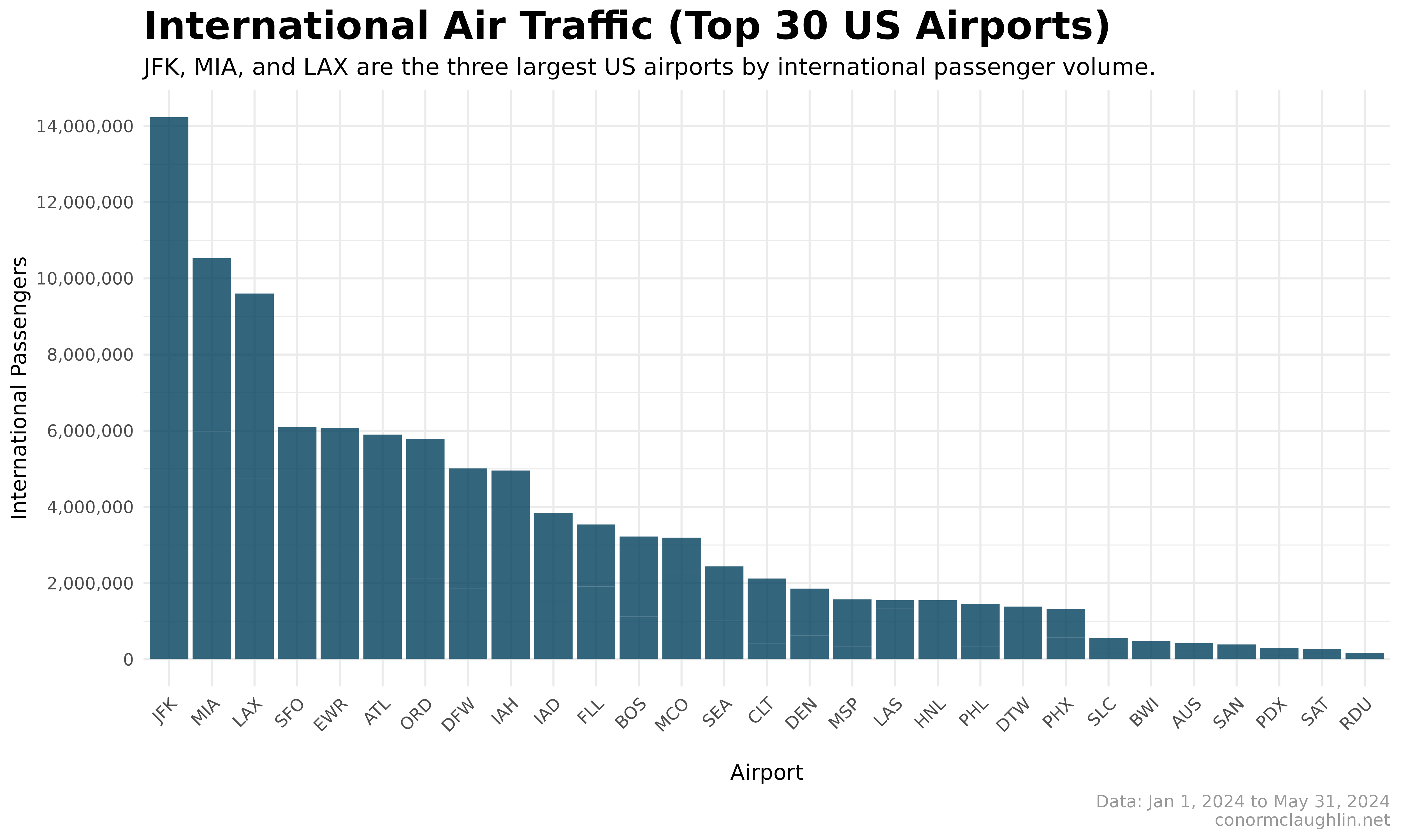
- The passenger volume of each airport: certain airports like JFK or LAX do a massive amount of international passenger volume while others like DEN or SLC have a much smaller volume - how can I make sure that is clear to the viewer?
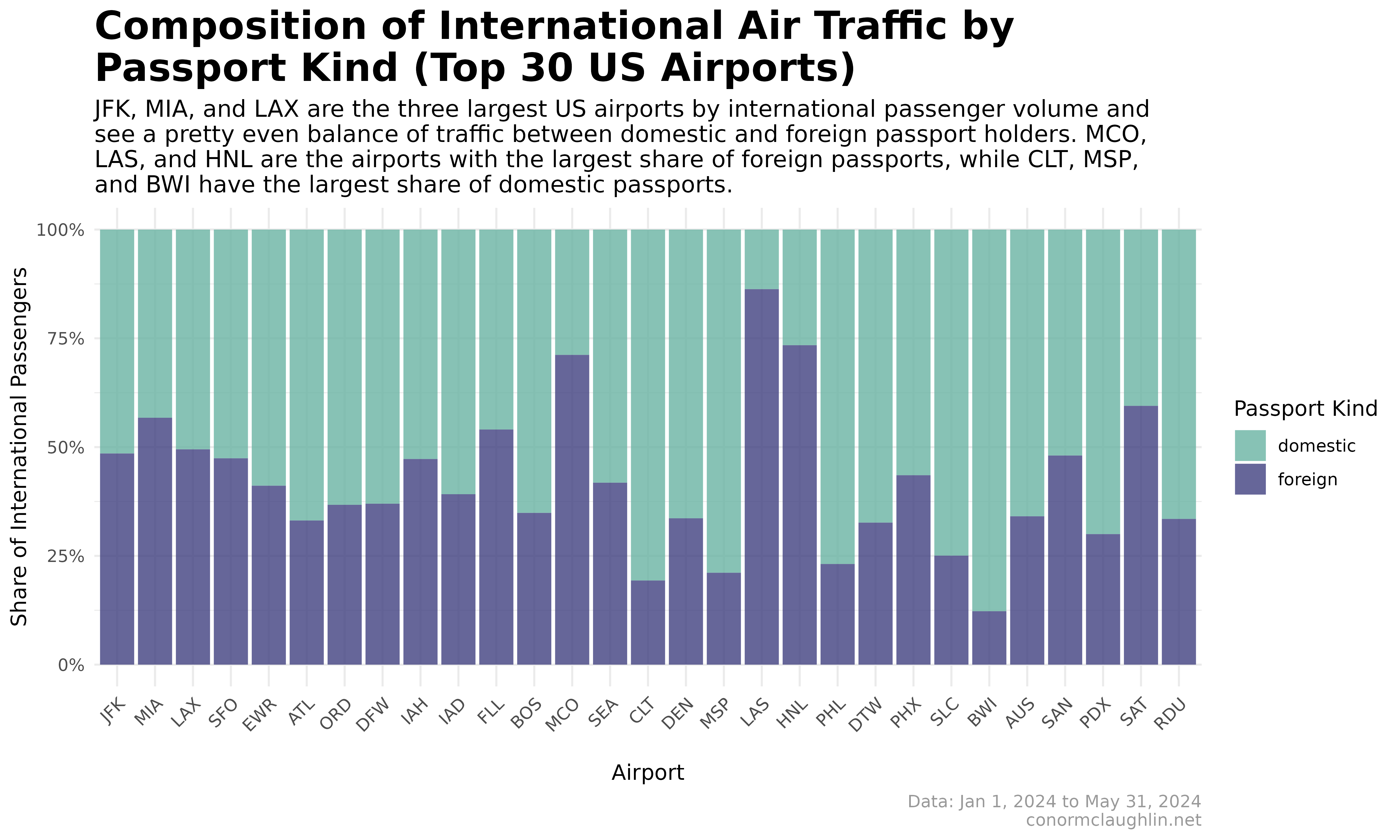
- The composition of passengers, foreign vs domestic at each airport: some airports like LAS have primarily foreign international traffic, which makes sense as the city is an attraction that people fly into the US to visit. Other airports, like CLT, don’t draw foreign visitors, but do move lots of Americans in and out of the country. I want to try to call out this distinction
The Visualizations
Bar Chart
While this chart does a great job of showing the passenger volume of each airport, it doesn’t help us understand the foreign vs domestic split at all - obviously!
100% Stacked Bar Chart
This chart gives us a handy breakdown of the relative share of foreign and domestic passport holders but loses track of the volume dimension.
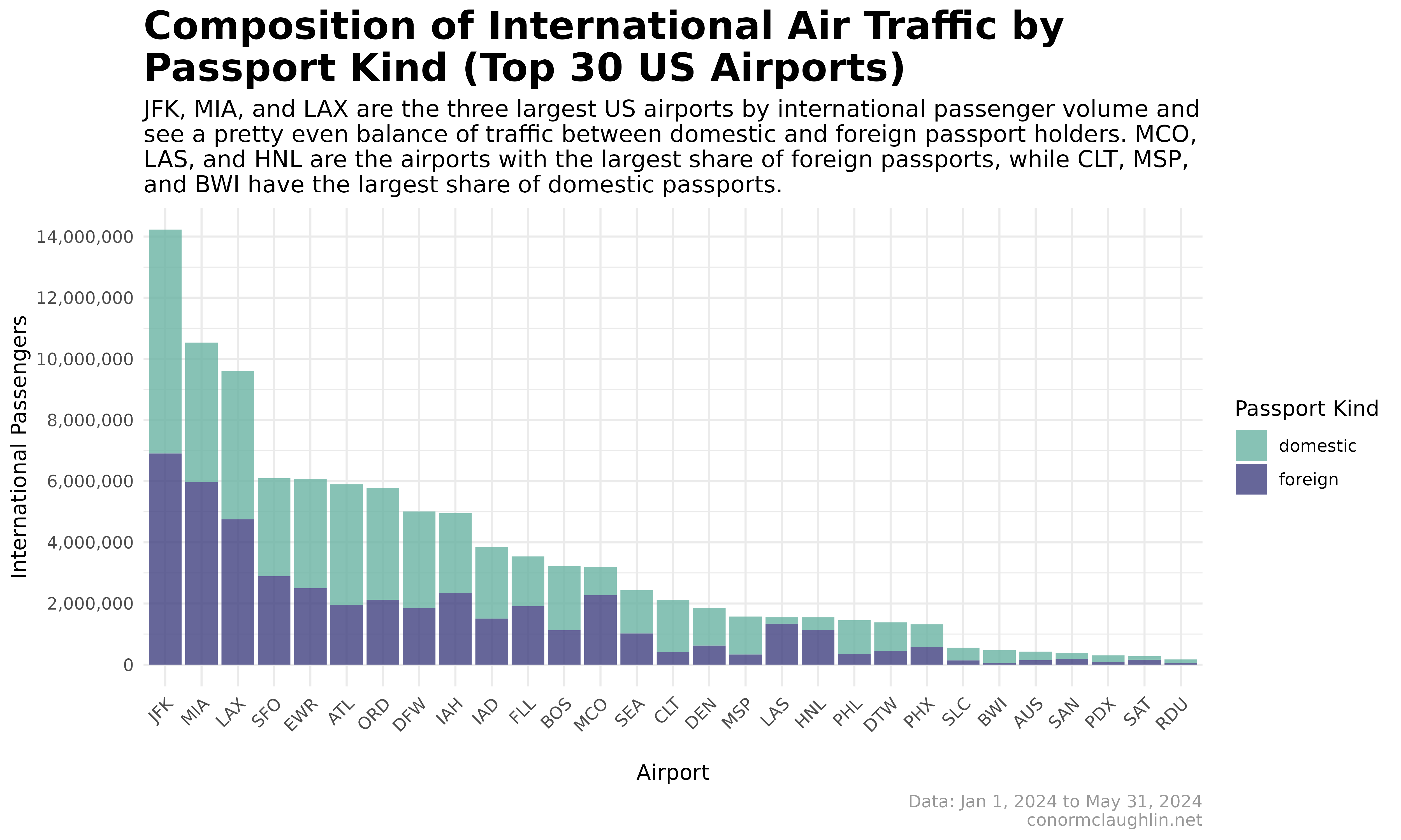
Stacked Bar Chart
Building a combination of charts one and two gives us a really nice, coherent view of passenger volume and its composition in a single chart.
The only issue here is that it can be a bit difficult to compare the proportion of foreign and domestic passengers between airports due to the differing bar heights - something our last chart aims to solve.
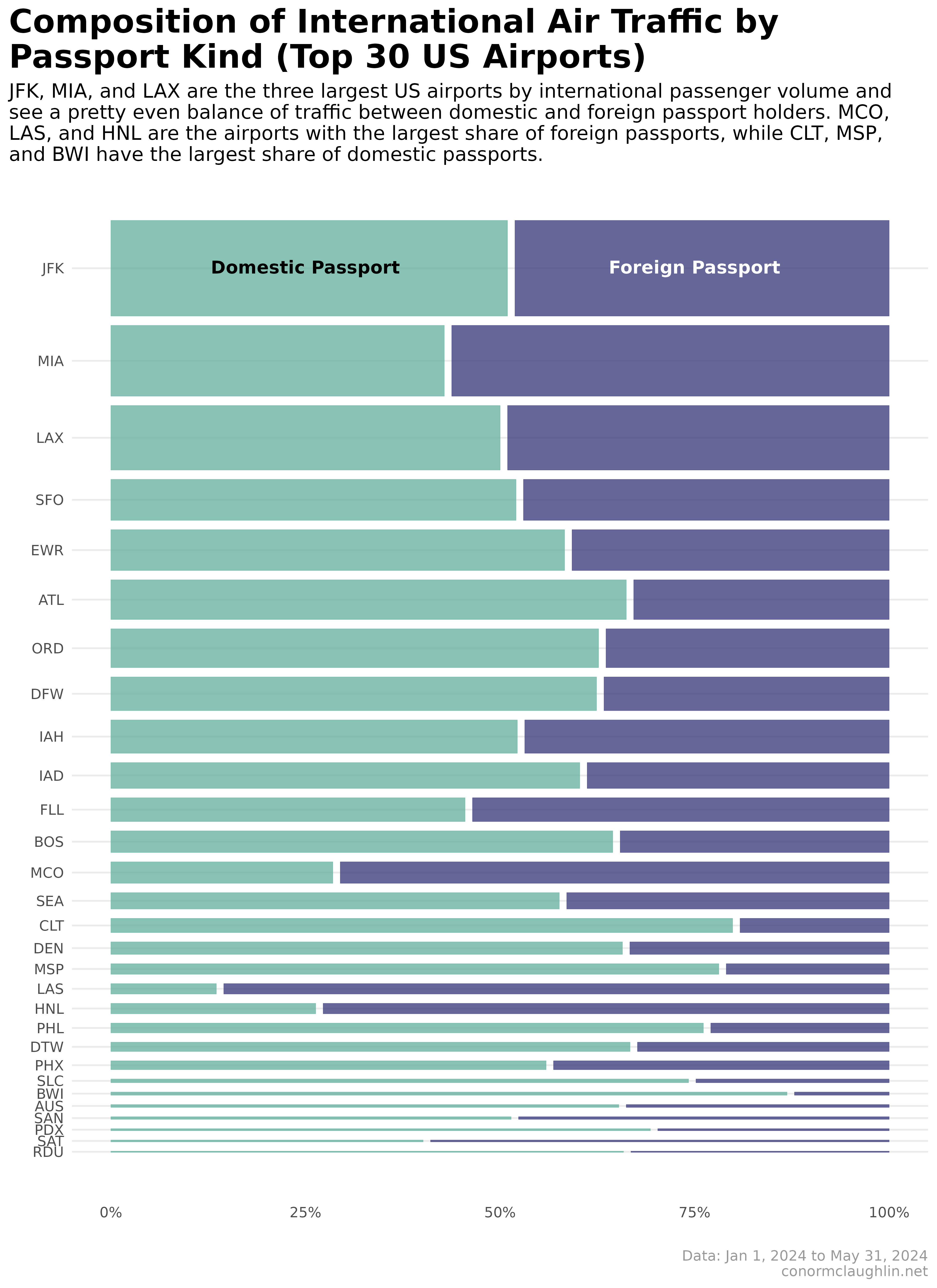
Mosaic Plot (or Marimekko Plot)
Mosaic plots (also known as Marimekko plots) are a way to add dimensionality to simpler plot types. In our case, what we want to do conceptually is add a “size” component to the 100% stacked bar chart (#2), so that it communicates the share of foreign and domestic passports while simultaneously educating the viewer on passenger volume through the bar sizing.
I was able to build the plot below using the very handy ggmosaic package in R - many thanks to its inventors!
Code Reference
# install the package
devtools::install_github("haleyjeppson/ggmosaic")
# import the package
library(ggmosaic)

# build the plot on top of our dataframe
df %>%
  mutate(airport = reorder(airport, passengers)) %>%
  ggplot() +
    geom_mosaic(aes(x = product(airport), fill = kind, weight = passengers), alpha = 0.8) +
    scale_fill_manual(values = c("#69b3a2", "#404080"), name = "Passport Kind") +
    scale_y_continuous(labels = scales::percent_format()) +
    coord_flip() +
    annotate("text", x = 0.95, y = 0.25, label = "Domestic Passport", fontface = "bold") +
    annotate("text", x = 0.95, y = 0.75, label = "Foreign Passport", color = "white", fontface = "bold") +
    theme_minimal() +
    theme(
      strip.background = element_rect(fill = "grey30"),
      strip.text = element_text(color = "grey97", face = "bold"),
      legend.background = element_rect(color = NA),
      plot.title = element_text(size = 20, face = "bold"),
      plot.subtitle = element_text(size = 12),
      plot.caption = element_text(colour = "grey60"),
      panel.grid.minor.x = element_blank(),
      panel.grid.major.x = element_blank(),
      legend.position = "",
      plot.title.position = "plot"
    ) +
    labs(
      x = "",
      y = "",
      title = "Composition of International Air Traffic by\nPassport Kind (Top 30 US Airports)",
      subtitle = "JFK, MIA, and LAX are the three largest US airports by international passenger volume and\nsee a pretty even balance of traffic between domestic and foreign passport holders. MCO,\nLAS, and HNL are the airports with the largest share of foreign passports, while CLT, MSP,\nand BWI have the largest share of domestic passports.",
      caption = "Data: Jan 1, 2024 to May 31, 2024\nconormclaughlin.net"
    )