Earlier this month I read through the presentation Lufthansa leadership shared with the media and their investors on Lufthansa Group (LHG) Capital Markets Day, on September 29th, 2025.
In the presentation, they lay out their plan to deliver an EBIT margin target of 8-10% by 2028 to 2030, double the 4% they returned in 2024.
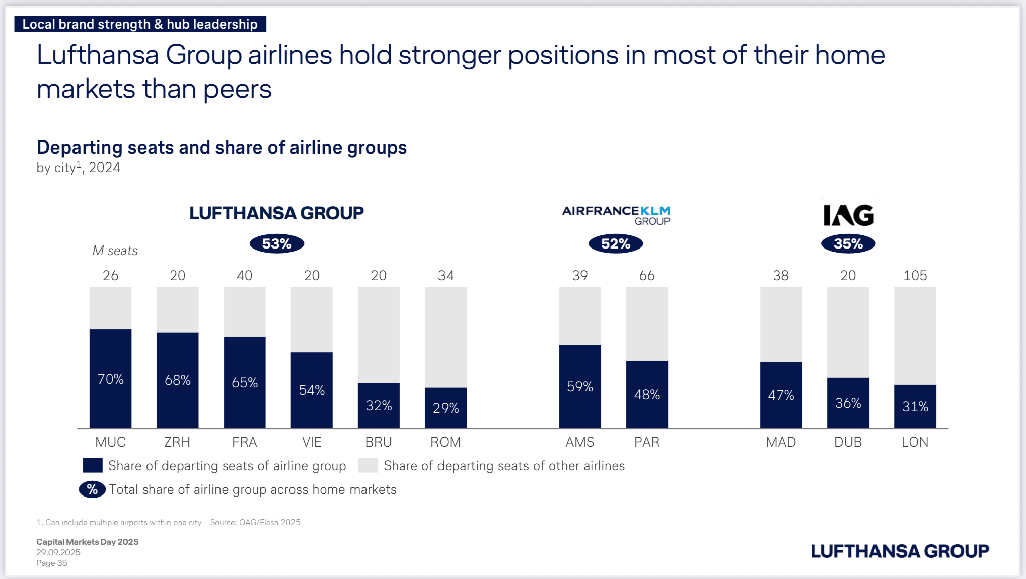
One of the key drivers of their plan is “Local brand strength & hub leadership”, which they assert by claiming to be the “leading operator in Europe’s most affluent markets”, and through “hold[ing] stronger positions in most of their home markets than peers”, as the presentation slide (#35) below highlights.
Let’s Talk About the Slide
What does it show us?
Read naively…
- Wow, Lufthansa has way more hubs than the other two airline groups
- It also looks like their main hubs are much stronger than the other airlines - I see a 70% and a few >60% markets!
- Okay London only has 31% share for IAG, that’s not good, that’s worse than Brussels
- IAG must be the worst of these airline groups since they have a much lower share of departing seats than both LHG and Air France/KLM Group
So what’s going on here?
Kudos to the Lufthansa Corp Dev team that put this slide together - it does an excellent job of presenting data in a way that maximizes LHG’s core strength and minimizes their weaknesses, while still being “truthful”. With that said, the intent of this slide is absolutely to mislead - so let’s talk about what they’re doing.
The core sin of this chart is burying the size of markets in the form of small text figures on top of a 100% stacked bar chart. That choice effectively treats every market as equal and ignores the fact that London is 4x the size of Munich!
Those stacked bars then show a bit of a vanity metric - share of departing seats in a given market isn’t exactly the same as profitability - but do well to tell the story that Lufthansa wants to tell, which is that it has captive hub markets.
With a bit more study, it comes clear that Paris (66M departing seats) and London (105M) are by far the two largest markets in scope, but it’s hard to understand the true impact of that when we just have market share percentages and total market seat figures on hand.
Visualizations
A more honest way of communicating this data would be to build indications of size into the graphics themselves, so that we can contextualize three different measures at the same time:
- Number of departing seats for the whole market
- Departing seats for the primary airline group
- Market share of the primary airline group in that hub
Since I don’t work at Lufthansa and can afford to be more objective in my chart design, I did some explorations with ggplot to try to see what kind of chart might best for relaying that information!
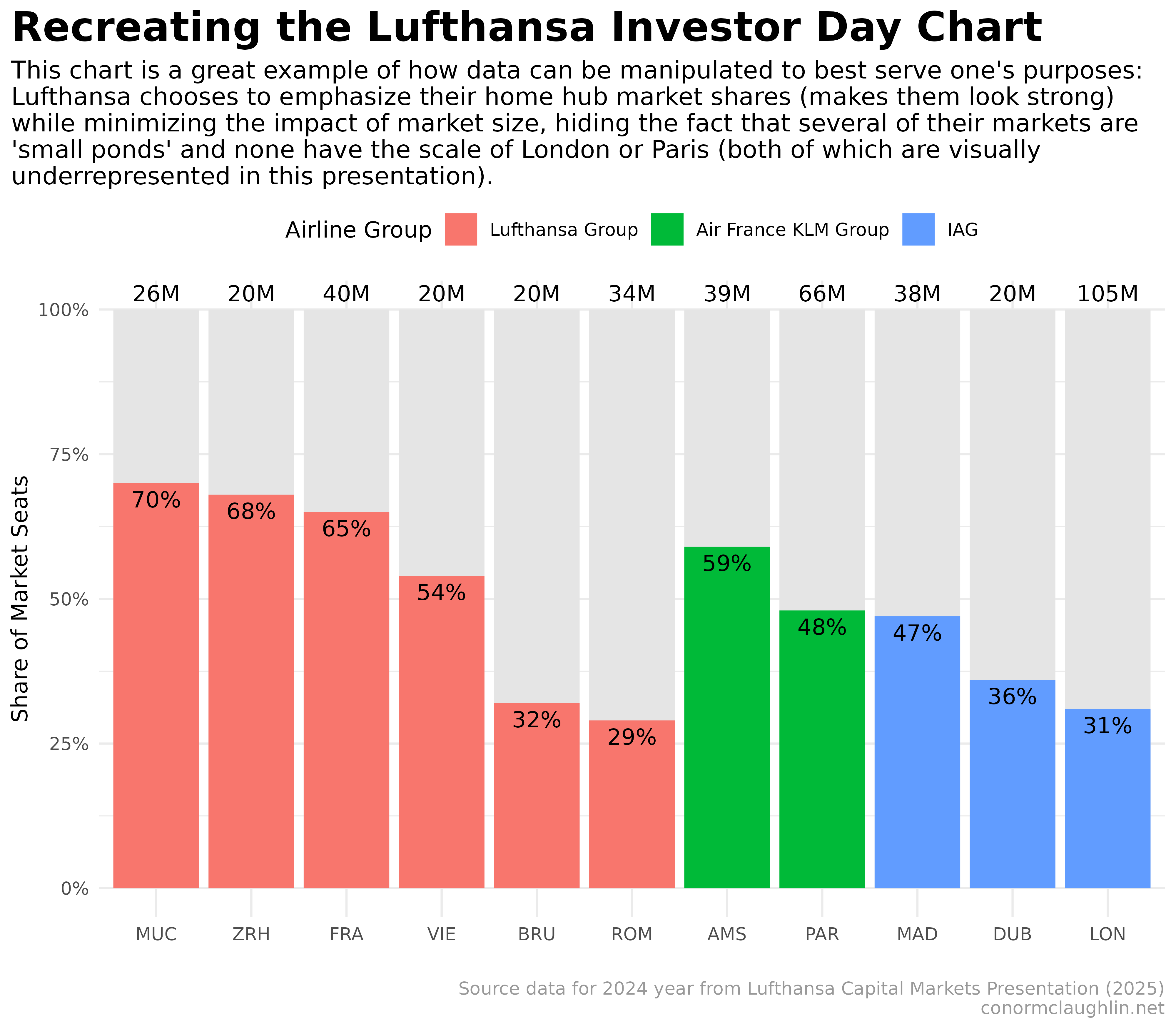
Recreating the Original Lufthansa Graphic
First off, I spent some time trying to recreate the original Lufthansa chart - while it required quite a bit of manual finagling to lay out the 100% stacked bars with text overlays, I think I was able to do a good job:
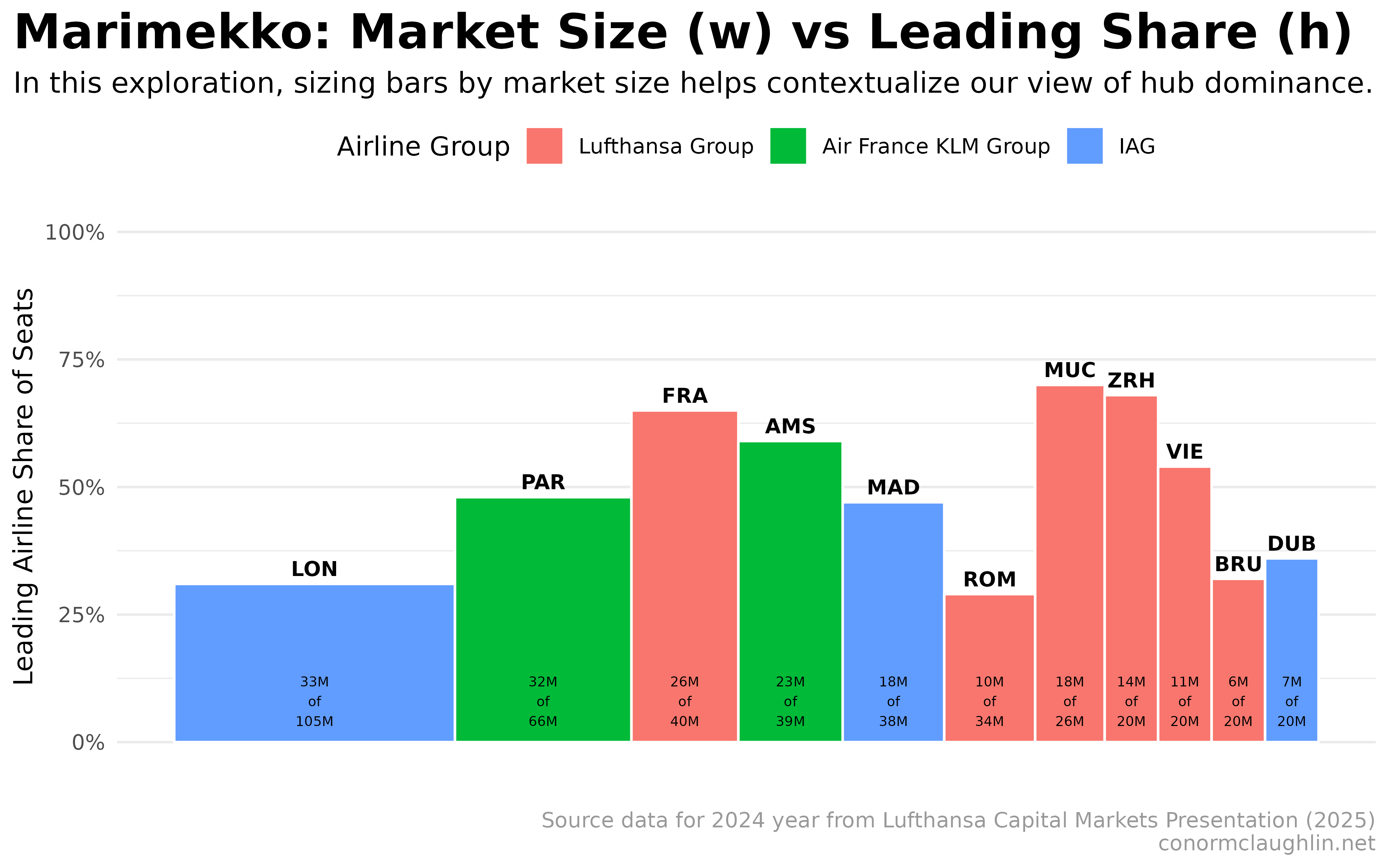
Experimenting with a Marimekko Chart
In this kind of chart, we use bar width to convey a size dimension on top of the primary measure. In this case, sizing the bars by total flights per market does help give indications of scale, but turning the uniform bars into rectangles makes everything a bit harder to read.
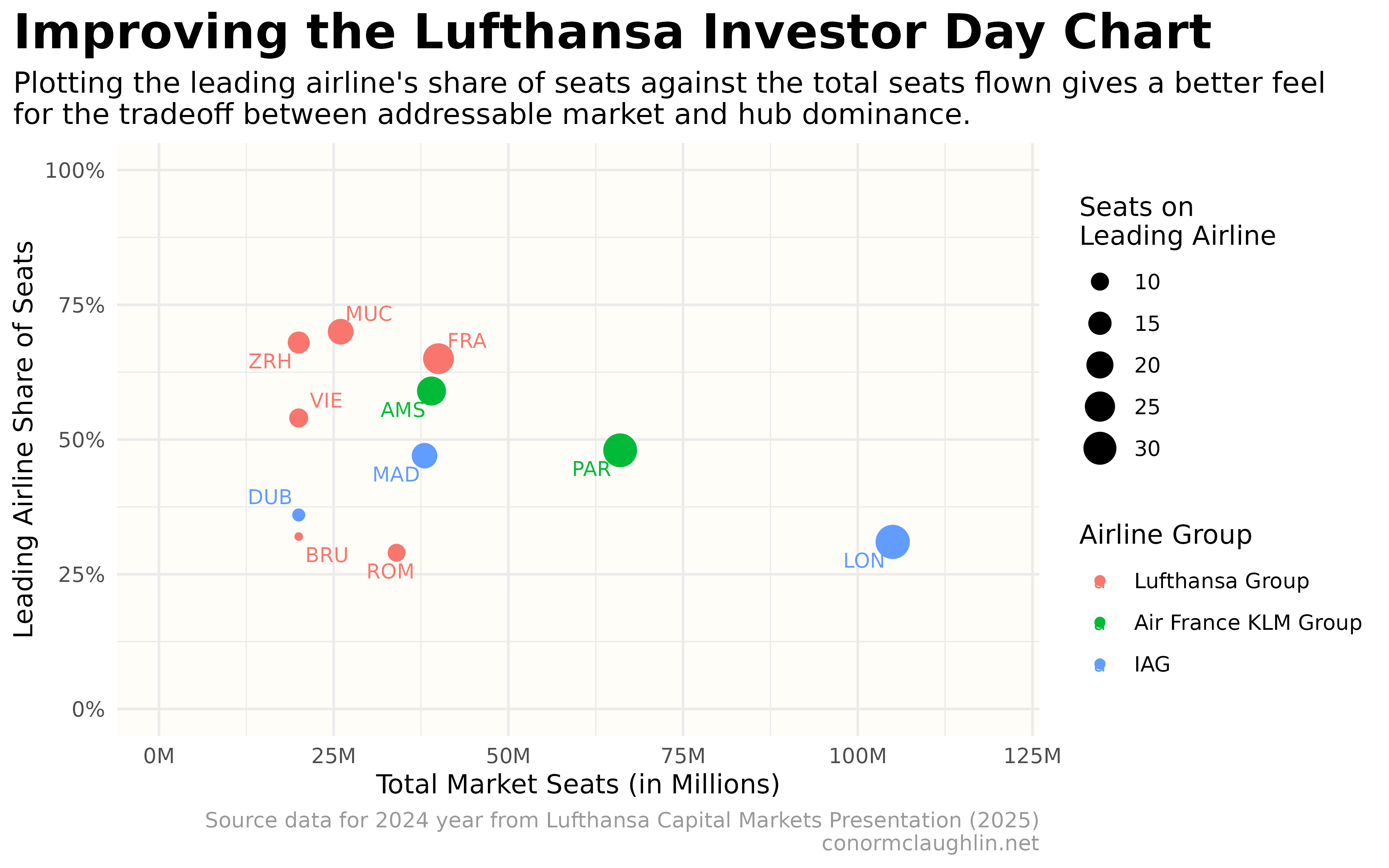
Exploring a Scatterplot
Changing forms and choosing to visualize the data as a scatterplot immediately improves the readability of the data, allowing us to easily see how Lufthansa Group’s hubs fit a certain archetype: smaller, “fortress” hubs, with high market share.
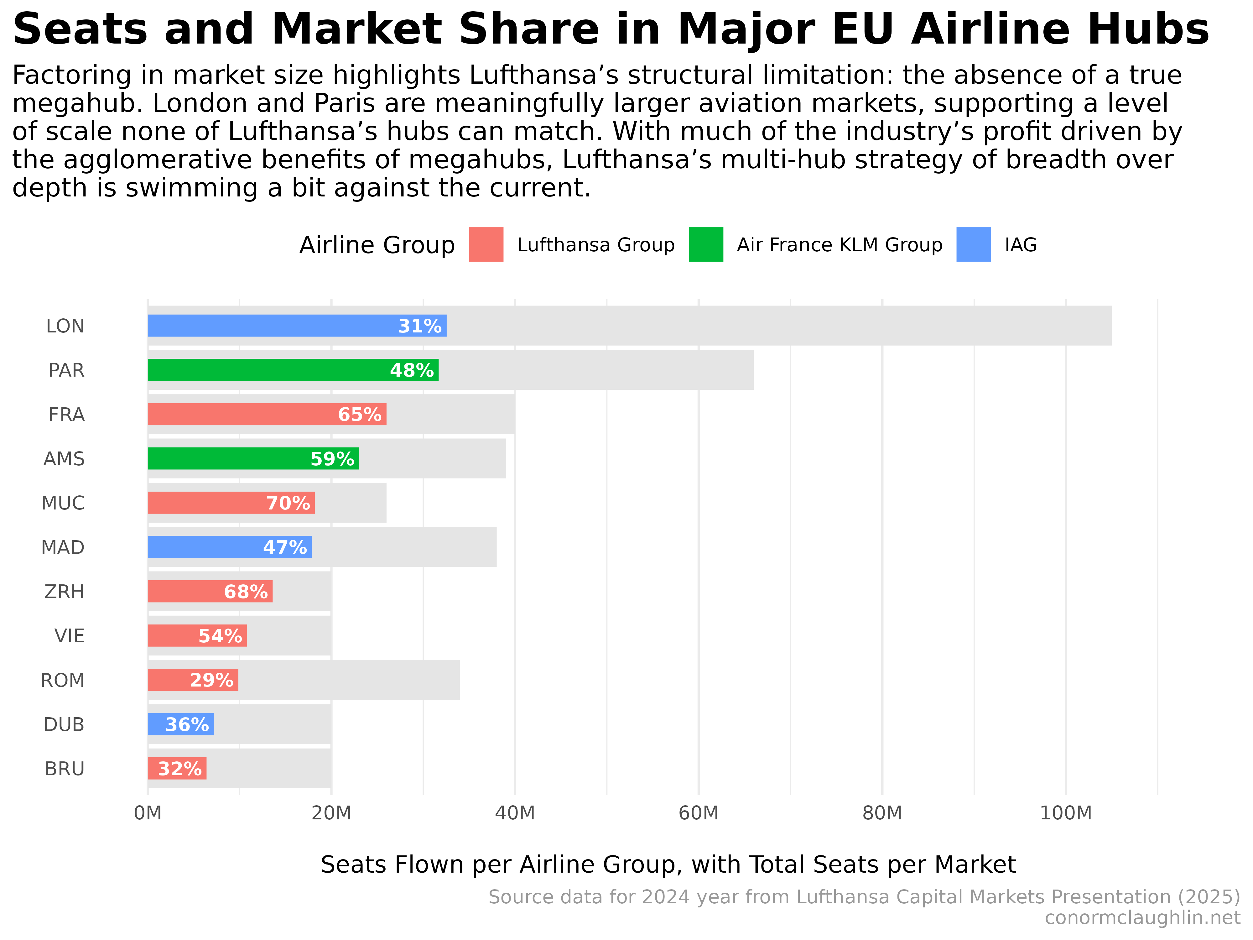
Concluding with a Bullet Chart
The scatterplot above does an excellent job of comparing the market share and market size measures, but makes it difficult to compare the number of seats the leading airlines are flying out of each hub.
My final stab at this effort, tries to pull everything together into one bullet chart, which captures:
- Size of the overall market as a the grey background bar
- Seats flown per leading carrier as the colored foreground bar
- Market share for the leading carrier as a proportion of the bars, and also a text label
It’s a little busy, but I think it’s the best of the three thus far? @Lufthansa, feel free to steal for your next presentation :)
Code Reference
Recreating the Lufthansa Graphic
ggplot(df, aes(x = market)) +
  geom_col(aes(y = total_share/100), fill = "grey90") +
  geom_text(aes(y = total_share/100, label = paste0(total_seats, "M"), vjust = -0.5)) +
  geom_col(aes(y = leading_share/100, fill = airline_group)) +
  geom_text(aes(y = leading_share/100, label = paste0(leading_share, '%'), vjust = 1.5)) +
  scale_y_continuous(labels = percent_format()) +
  guides(fill = guide_legend(title = "Airline Group")) +
  coord_cartesian(clip = "off") +
  theme_minimal() +
  theme(
      strip.background = element_rect(fill = "grey30"),
      strip.text = element_text(color = "grey97", face = "bold"),
      legend.background = element_rect(color = NA),
      legend.position = "top",
      plot.title = element_text(size = 20, face = "bold"),
      plot.subtitle = element_text(size = 12),
      plot.caption = element_text(colour = "grey60"),
      plot.title.position = "plot"
  ) +
  labs(
      x = "",
      y = "Share of Market Seats",
      title = "Recreating the Lufthansa Investor Day Chart",
      subtitle = "This chart is a great example of how data can be manipulated to best serve one's purposes:\nLufthansa chooses to emphasize their home hub market shares (makes them look strong)\nwhile minimizing the impact of market size, hiding the fact that several of their markets are\n'small ponds' and none have the scale of London or Paris (both of which are visually\nunderrepresented in this presentation).",
      caption = "Source data for 2024 year from Lufthansa Capital Markets Presentation (2025)\nconormclaughlin.net"
  )
Marimekko
df_mekko <- df %>%
  mutate(
    width   = total_seats / sum(total_seats),   # market width
    height  = seats / total_seats               # leading share (0–1)
  ) %>%
  arrange(desc(width)) %>%
  mutate(
    xmin = lag(cumsum(width), default = 0),
    xmax = cumsum(width),
    ymin = 0,
    ymax = height,
    xmid = (xmin + xmax) / 2
  )

ggplot(df_mekko) +
  geom_rect(aes(xmin = xmin, xmax = xmax, ymin = ymin, ymax = ymax, fill = airline_group), color = "white") +
  geom_text(aes(x = xmid, y = pmin(ymax + 0.03, 1), label = market), size = 3, fontface = "bold") +
  geom_text(aes(x = xmid, y = 0.08, label = paste0(round(seats, 0), "M", "\nof\n", total_seats, "M")), size = 2) +
  scale_y_continuous(labels = scales::percent_format(), limits = c(0, 1)) +
  guides(fill = guide_legend(title = "Airline Group")) +
  coord_cartesian(clip = "off") +
  theme_minimal() +
  theme(
      axis.text.x = element_blank(),
      panel.grid.major.x = element_blank(),
      panel.grid.minor.x = element_blank(),
      strip.background = element_rect(fill = "grey30"),
      strip.text = element_text(color = "grey97", face = "bold"),
      legend.background = element_rect(color = NA),
      legend.position = "top",
      plot.title = element_text(size = 20, face = "bold"),
      plot.subtitle = element_text(size = 12),
      plot.caption = element_text(colour = "grey60"),
      plot.title.position = "plot"
  ) +
  labs(
      x = "",
      y = "Leading Airline Share of Seats",
      title = "Marimekko: Market Size (w) vs Leading Share (h)",
      subtitle = "In this exploration, sizing bars by market size helps contextualize our view of hub dominance.",
      caption = "Source data for 2024 year from Lufthansa Capital Markets Presentation (2025)\nconormclaughlin.net"
  )
Scatterplot
ggplot(df, aes(x = total_seats, y = leading_share / 100, color = airline_group, label = market)) +
  geom_point(aes(size = seats)) +
  scale_x_continuous(limits = c(0,120), labels = label_number(suffix = "M")) +
  scale_y_continuous(limits = c(0,1), labels = label_percent()) +
  geom_text_repel(size = 3) +
  guides(
    color = guide_legend(title = "Airline Group"),
    size = guide_legend(title = "Seats on\nLeading Airline")
  ) +
  theme_minimal() +
  theme(
      strip.background = element_rect(fill = "grey30"),
      strip.text = element_text(color = "grey97", face = "bold"),
      legend.background = element_rect(color = NA),
      plot.title = element_text(size = 20, face = "bold"),
      plot.subtitle = element_text(size = 12),
      plot.caption = element_text(colour = "grey60"),
      plot.title.position = "plot",
      panel.background = element_rect(fill = "#FFFDF8", color = NA)
  ) +
  labs(
      x = "Total Market Seats (in Millions)",
      y = "Leading Airline Share of Seats",
      title = "Improving the Lufthansa Investor Day Chart",
      subtitle = "Plotting the leading airline's share of seats against the total seats flown gives a better feel\nfor the tradeoff between addressable market and hub dominance.",
      caption = "Source data for 2024 year from Lufthansa Capital Markets Presentation (2025)\nconormclaughlin.net"
  )
Bullet Chart
ggplot(df_plot, aes(y = reorder(market, seats))) +
  geom_col(aes(x = total_seats), fill = "grey90") +
  geom_col(aes(x = seats, fill = airline_group), width = 0.5) +
  geom_text(aes(x = seats, label = percent(leading_share / 100), hjust = 1.1), size = 3, fontface = "bold", color = "white") +
  scale_x_continuous(
    limits = c(0, max_x),
    labels = label_number(suffix = "M"),
    breaks = pretty_breaks(6)
  ) +
  guides(fill = guide_legend(title = "Airline Group")) +
  coord_cartesian(clip = "off") +
  theme_minimal() +
  theme(
      panel.grid.major.y = element_blank(),
      strip.background = element_rect(fill = "grey30"),
      strip.text = element_text(color = "grey97", face = "bold"),
      legend.background = element_rect(color = NA),
      legend.position = "top",
      plot.title = element_text(size = 20, face = "bold"),
      plot.subtitle = element_text(size = 12),
      plot.caption = element_text(colour = "grey60"),
      plot.title.position = "plot"
  ) +
  labs(
      x = "\nSeats Flown per Airline Group, with Total Seats per Market",
      y = "",
      title = "Seats and Market Share in Major EU Airline Hubs",
      subtitle = "Factoring in market size highlights Lufthansa’s structural limitation: the absence of a true\nmegahub. London and Paris are meaningfully larger aviation markets, supporting a level\nof scale none of Lufthansa’s hubs can match. With much of the industry’s profit driven by\nthe agglomerative benefits of megahubs, Lufthansa’s multi-hub strategy of breadth over\ndepth is swimming a bit against the current.",
      caption = "Source data for 2024 year from Lufthansa Capital Markets Presentation (2025)\nconormclaughlin.net"
  )