On Wednesday night, as I watched the Hoos smoke Georgia Tech in a 94-68 win, the perfect blog post idea popped into my head.
In December, I wrote a fun post identifying some of the (early) changes in Virginia’s playing style under new head coach Ryan Odom. At the time, the differences in pace of play and shot distribution really stood out, for good reason! But what I hadn’t yet caught onto were the differences in rotation, lineups, and substitution patterns… until the Georgia Tech game made that crystal clear.
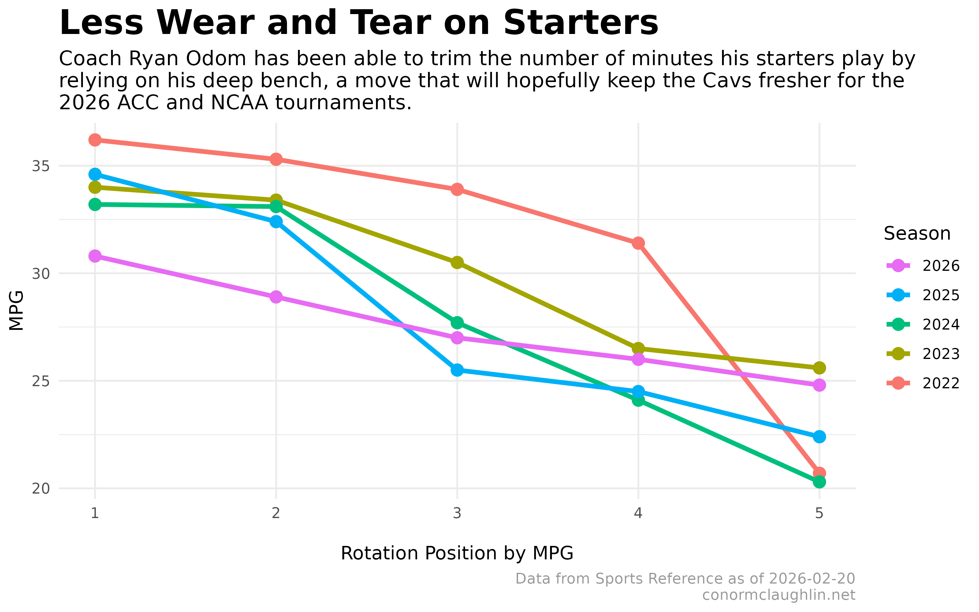
In that game, Coach Odom left his “bench mob” unit in the game for a long time as they piled on the points - ending with all 14 players on the team seeing the court and 11 of them scoring points. Only one starter played more than 22 minutes, and four different bench guys played double-figure minutes.
This broad and varied rotation contrasted sharply against my memories of Virginia’s playing style under Coach Bennett, which always felt tighter and more dependent on its top players - partly due to the difficulty of executing Bennett’s pack-line defensive scheme, and partly due to what I felt was a scarcity of players able to easily generate offense.
Visualizations
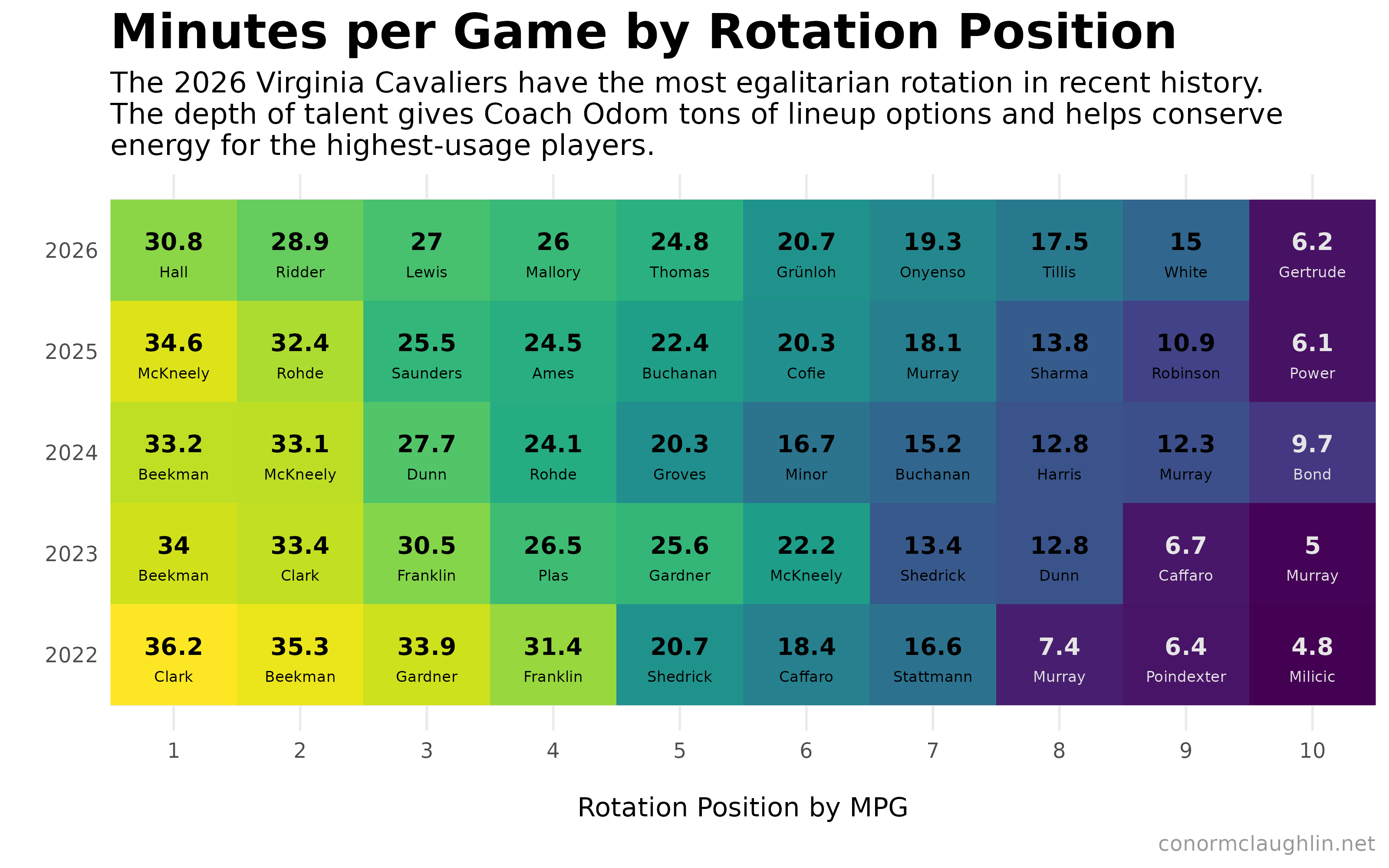
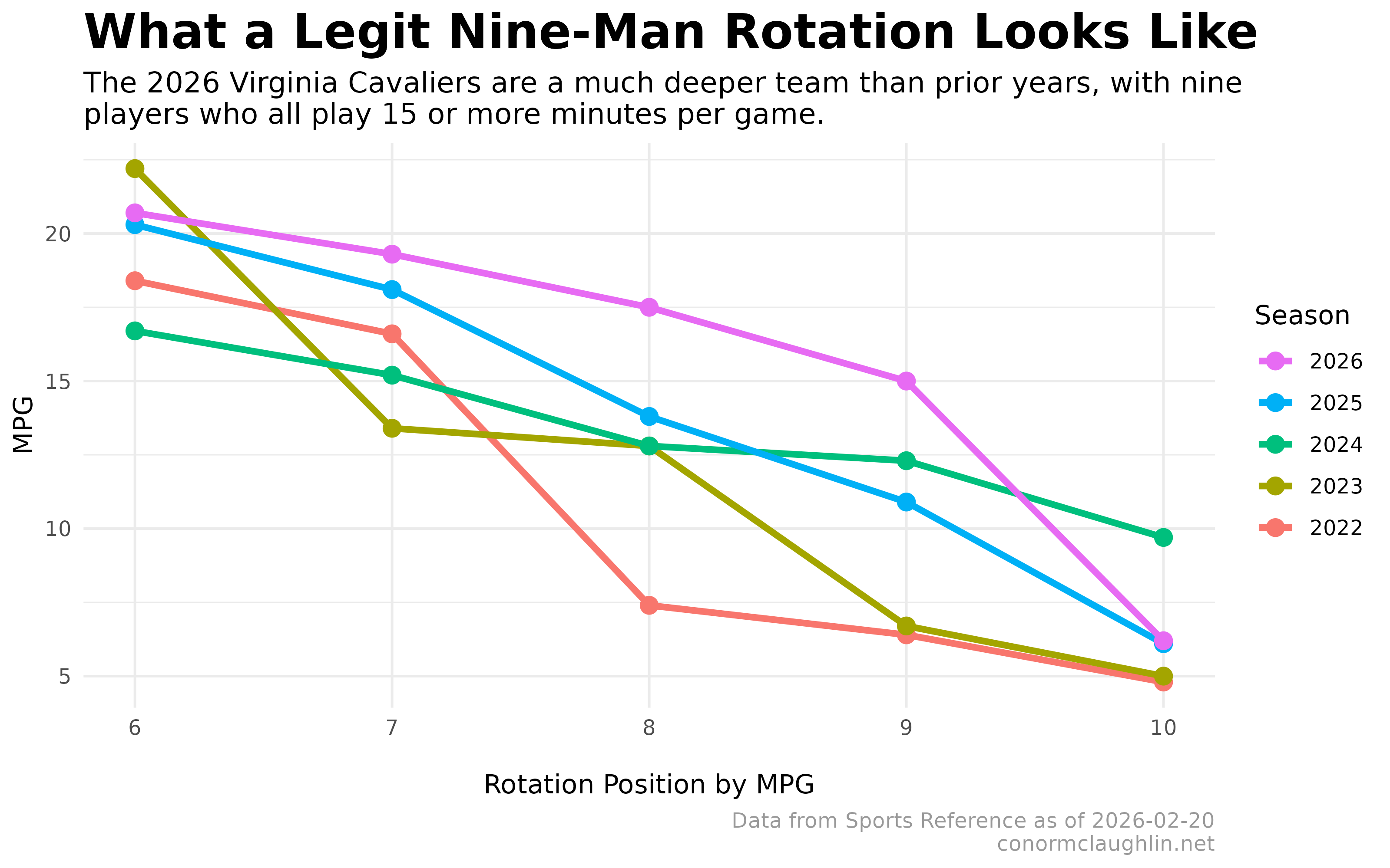
With those thoughts as the backdrop, I dove into Sports Reference data capturing minutes per game per player in ACC conference play over the last five seasons. After some fiddling with ggplot charts, I was able to put together some visualizations that confirmed my suspicions and indicated that yes, Odom is playing a deeper, more egalitarian rotation that pulls more from spots 7, 8, and 9 in the rotation and requires fewer minutes from the highest-usage players, which should help keep them fresher for late in the season.
Take a look below to see just how different this season is from prior years!
Code Reference
Read and Combine Yearly Per-Game Statistics
library(readr)
library(tidyverse)
library(purrr)
library(stringr)

df <- list.files(".", pattern = "\\.csv$", full.names = TRUE) %>%
  set_names() %>%
  map_dfr(~ read_csv(.x) %>%
            mutate(year = str_extract(basename(.x), "\\d{4}") %>% as.integer())
  )


df <- df %>%
  group_by(year) %>%
  mutate(rank_MP = min_rank(desc(MP))) %>%
  ungroup()

df <- df %>%
  mutate(
    surname = Player %>%
      str_remove("\\s+(Jr\\.?|Sr\\.?|II|III|IV|V)$") %>%
      word(-1)
  )

df <- df %>% mutate(role = if_else(rank_MP <= 5, "Starter", "Bench"))
Heatmap Chart
library(viridis)

df %>%
  filter(rank_MP <= 10) %>%
  ggplot(aes(x = rank_MP, y = year, fill = MP)) +
    geom_tile() +
    geom_text(aes(label = MP, color = MP > 10), size = 3.5, vjust = 0, fontface = "bold") +
    scale_color_manual(values = c("TRUE" = "black", "FALSE" = "grey90"),guide = "none") +
    geom_text(aes(label = surname, , color = MP > 10), size = 2.2, vjust = 2.5) +
    scale_fill_viridis(guide = "none") +
    scale_x_continuous(breaks = 1:10, labels = 1:10, expand = c(0, 0)) +
    theme_minimal() +
    theme(
      panel.grid.minor.x = element_blank(),
      strip.background = element_rect(fill = "grey30"),
      strip.text = element_text(color = "grey97", face = "bold"),
      legend.background = element_rect(color = NA),
      plot.title = element_text(size = 20, face = "bold"),
      plot.subtitle = element_text(size = 12),
      plot.caption = element_text(colour = "grey60"),
      #plot.title.position = "plot"
    ) +
    labs(
      x = "\nRotation Position by MPG",
      y = "",
      title = "Minutes per Game by Rotation Position",
      subtitle = "The 2026 Virginia Cavaliers have the most egalitarian rotation in recent history.\nThe depth of talent gives Coach Odom tons of lineup options and helps conserve\nenergy for the highest-usage players.",
      caption = "conormclaughlin.net"
    )
Line Chart
df %>%
  filter(rank_MP >= 6 & rank_MP <= 10) %>%
  ggplot(aes(x = rank_MP, y = MP, color = factor(year), group = factor(year))) +
    geom_line(size = 1.3) +
    geom_point(size = 3) +
    scale_color_discrete(name = "Season", breaks = rev(levels(factor(df$year)))) +
    theme_minimal() +
    theme(
      panel.grid.minor.x = element_blank(),
      strip.background = element_rect(fill = "grey30"),
      strip.text = element_text(color = "grey97", face = "bold"),
      legend.background = element_rect(color = NA),
      plot.title = element_text(size = 20, face = "bold"),
      plot.subtitle = element_text(size = 12),
      plot.caption = element_text(colour = "grey60"),
      #plot.title.position = "plot"
    ) +
    labs(
      x = "\nRotation Position by MPG",
      y = "MPG",
      title = "What a Legit Nine-Man Rotation Looks Like",
      subtitle = "The 2026 Virginia Cavaliers are a much deeper team than prior years, with nine\nplayers who all play 15 or more minutes per game.",
      caption = "Data from Sports Reference as of 2026-02-20\nconormclaughlin.net"
    )