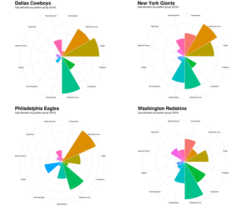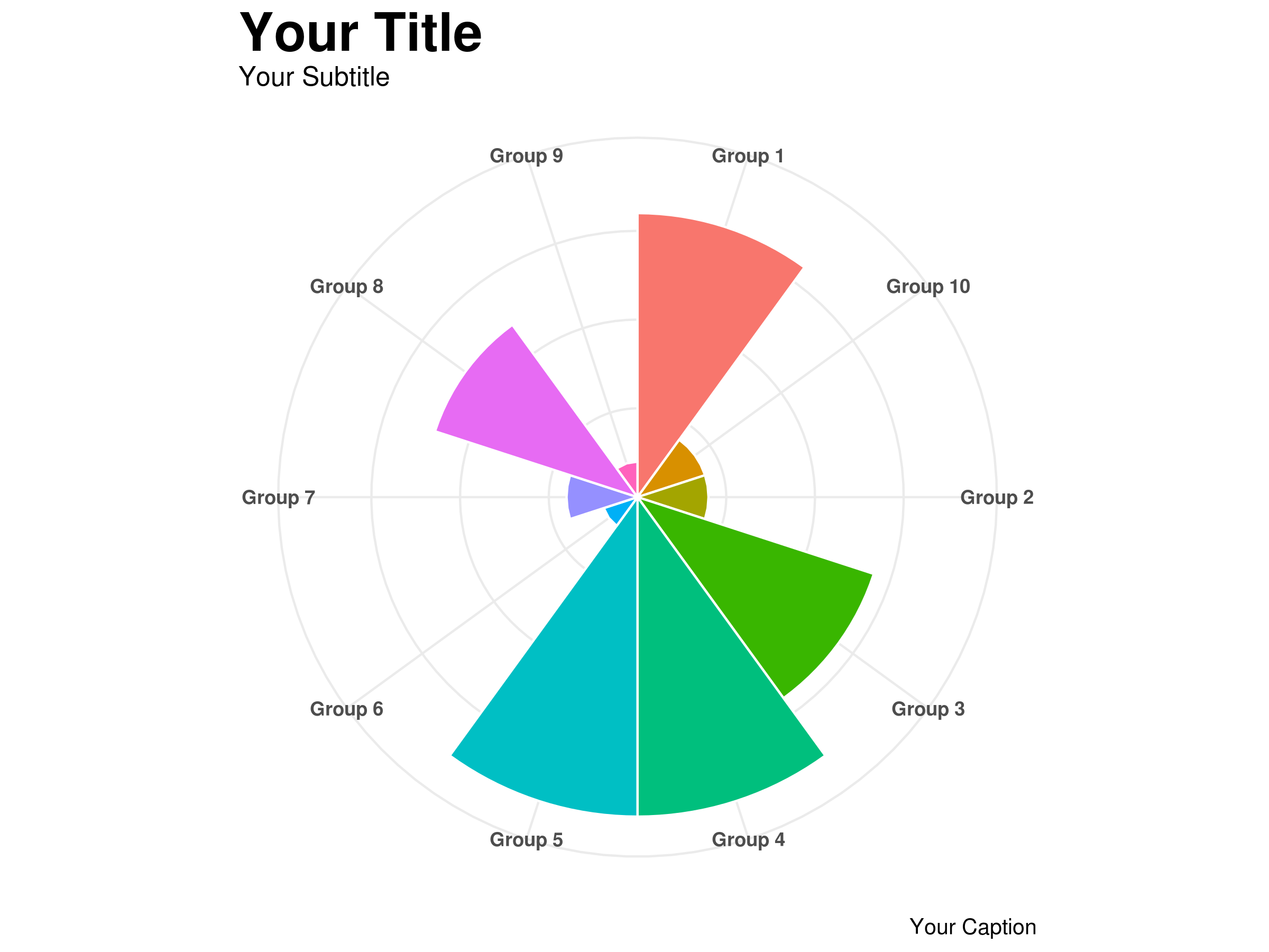
While I was working on my last post about NFL salary cap allocation, I struggled with how best to present the information. I knew I wanted the focus to be on outliers, but was finding a standard pie chart to be dull, and bar chart to be hard to compare. Fortunately, I stumbled upon the circumplex chart and realized this was exactly what I was looking for.
I found a number of good resources to help me on my way, most notably this post by Learning R, but ultimately ended up heavily customizing the charts until they felt right. Let’s take a look at what it takes to build and customize one of these charts!